Ulys
Ulys
Ulys



[OVERVIEW]
In the fast-paced world of digital travel solutions, Ulys emerged in 2019 as Vinci Autoroutes’ answer to seamless highway experiences. With over 6 million users (2023) trusting its toll badge system, Ulys becomes a staple for both individual travelers and professionals alike.
As a product designer apprentice on the Web team, I led the redesign the B2C landing page for the acquisition team.
[ROLE]
Product designer
[SCOPE]
Research
UX Design
UI Design
[TIMELINE]
Nov - Jan 2023
Introduction
Introduction
Ulys' acquisition teams relies on landing pages to effectively promote B2C and B2B toll badge subscription offers. However, the current outcomes have not met expectations. Thus, they requested the Web team to redesign the landing pages to enhance the user experience and boost conversion rates.
Ulys' acquisition teams relies on landing pages to effectively promote B2C and B2B toll badge subscription offers. However, the current outcomes have not met expectations. Thus, they requested the Web team to redesign the landing pages to enhance the user experience and boost conversion rates.
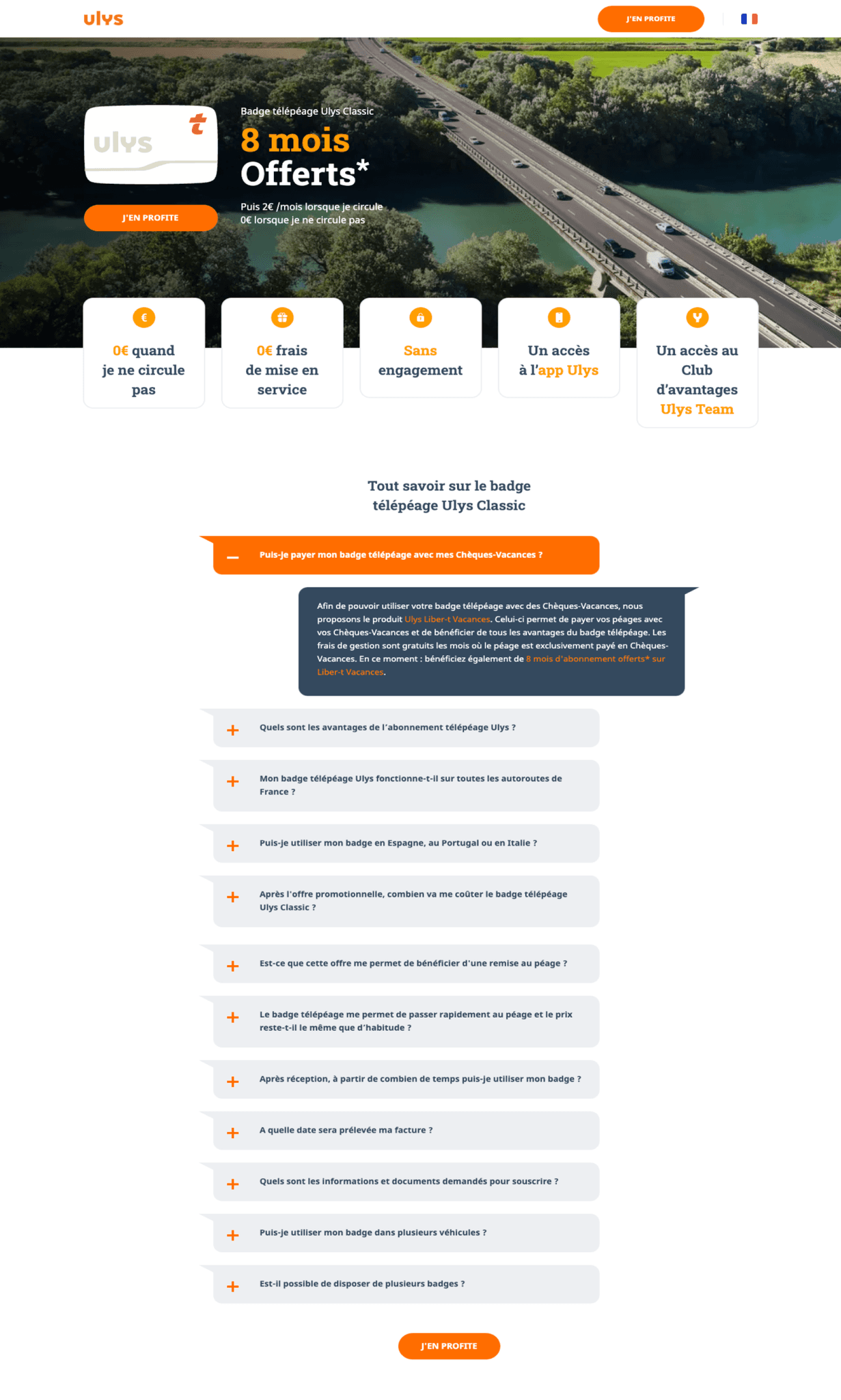


Current B2C landing page
The problem
The problem
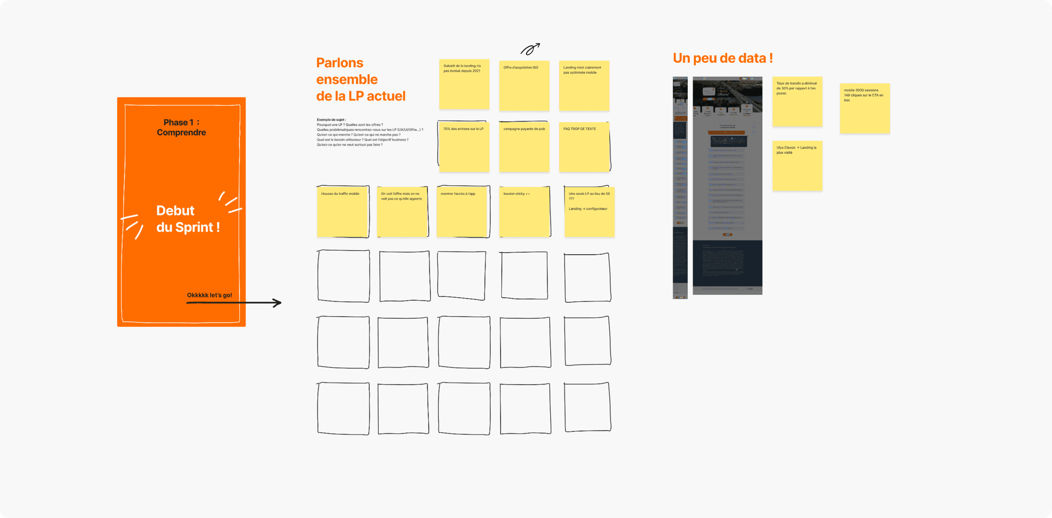
The existing B2C landing page was underperforming in terms of user engagement and conversion rate. Key information about the subscription were not clearly presented leading to new clients making uniformed decisions. Additionally, the lack of compelling visuals and poor mobile optimization resulted in losing potential customers.
The existing B2C landing page was underperforming in terms of user engagement and conversion rate. Key information about the subscription were not clearly presented leading to new clients making uniformed decisions. Additionally, the lack of compelling visuals and poor mobile optimization resulted in losing potential customers.
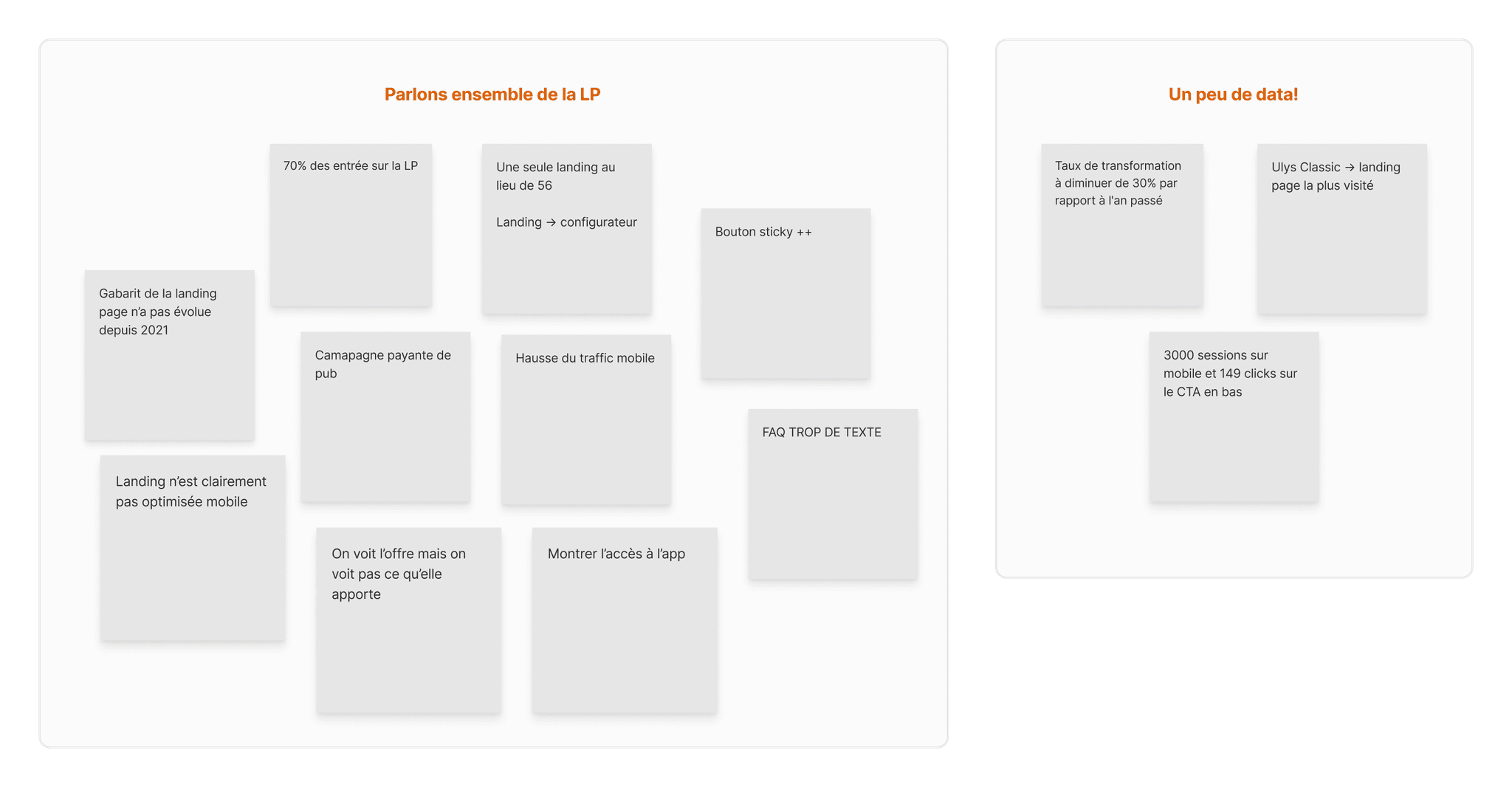


The process
The process
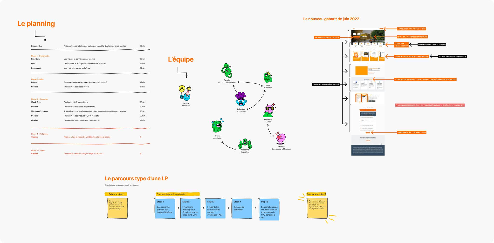
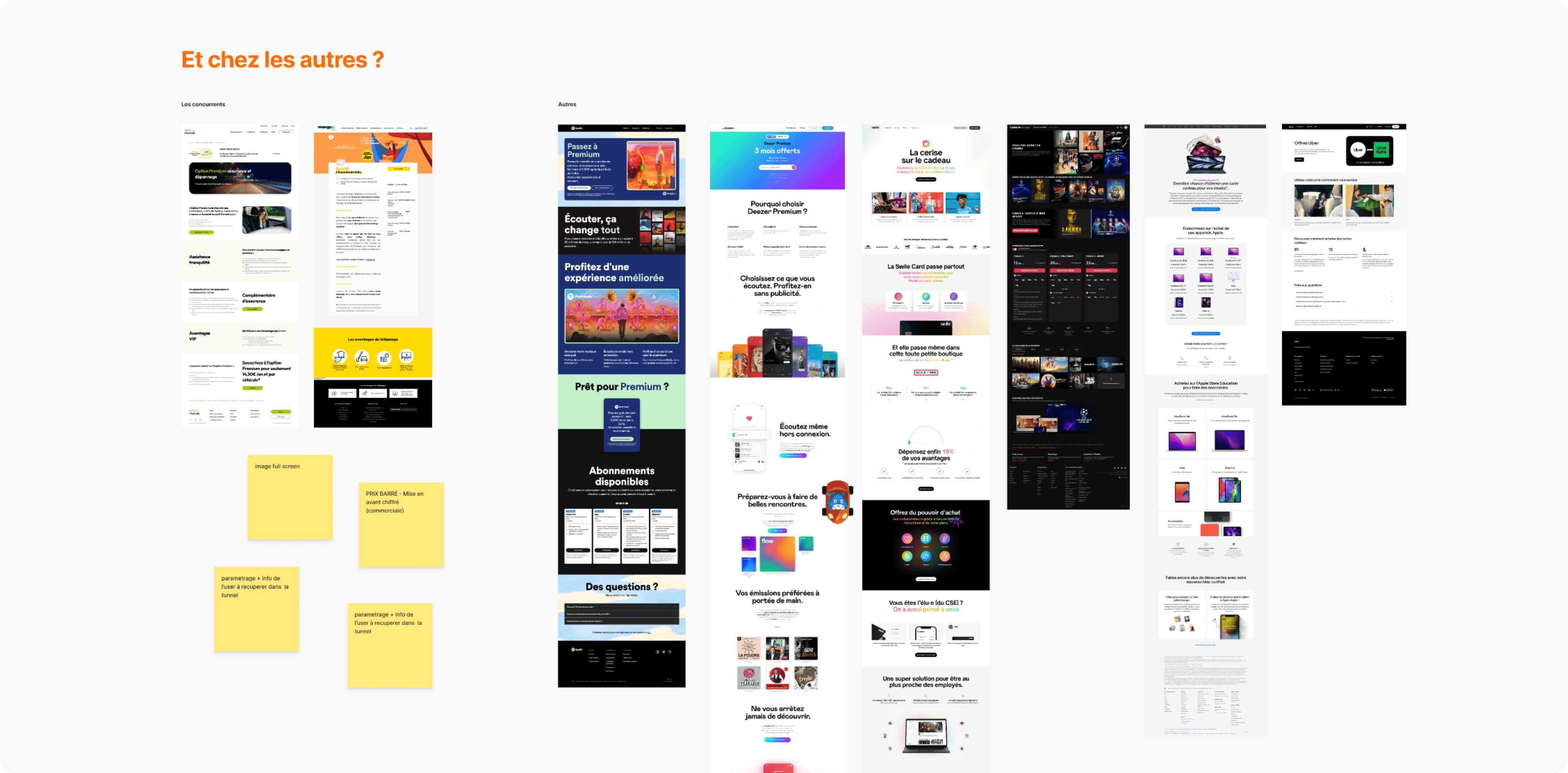
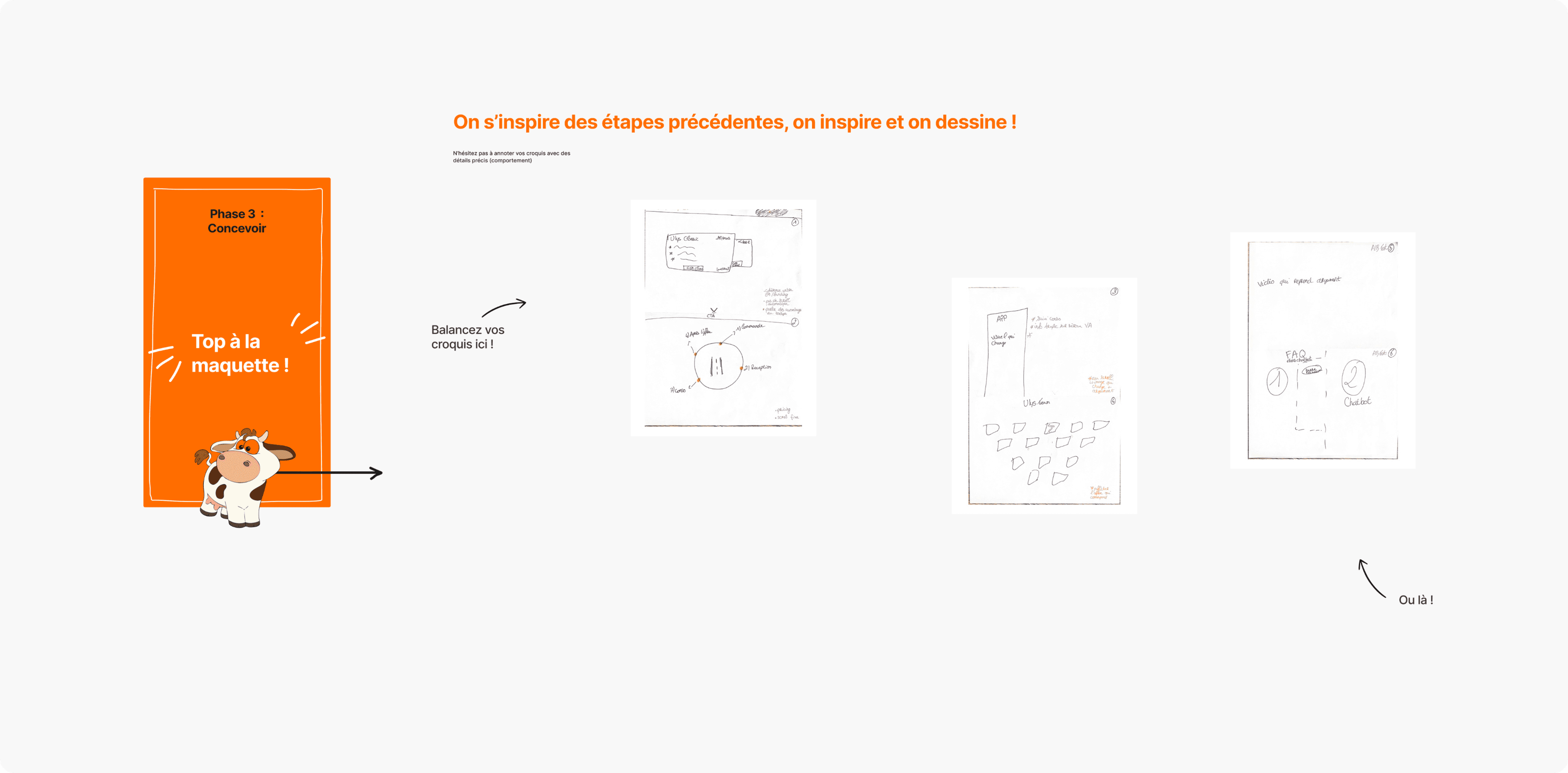
To address stakeholders' request, we organized design sprint workshops. These sessions included exercises focused on understanding the problem, identifying user needs, discovering best design practices and sketching ideas. Starting from low-fidelity wireframes created during these workshops, we progressed to designing high-fidelity wireframes.
To address stakeholders' request, we organized design sprint workshops. These sessions included exercises focused on understanding the problem, identifying user needs, discovering best design practices and sketching ideas. Starting from low-fidelity wireframes created during these workshops, we progressed to designing high-fidelity wireframes.
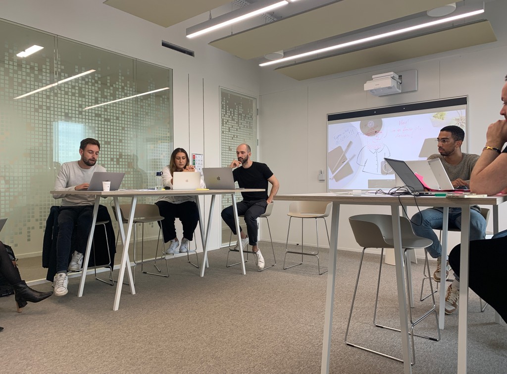


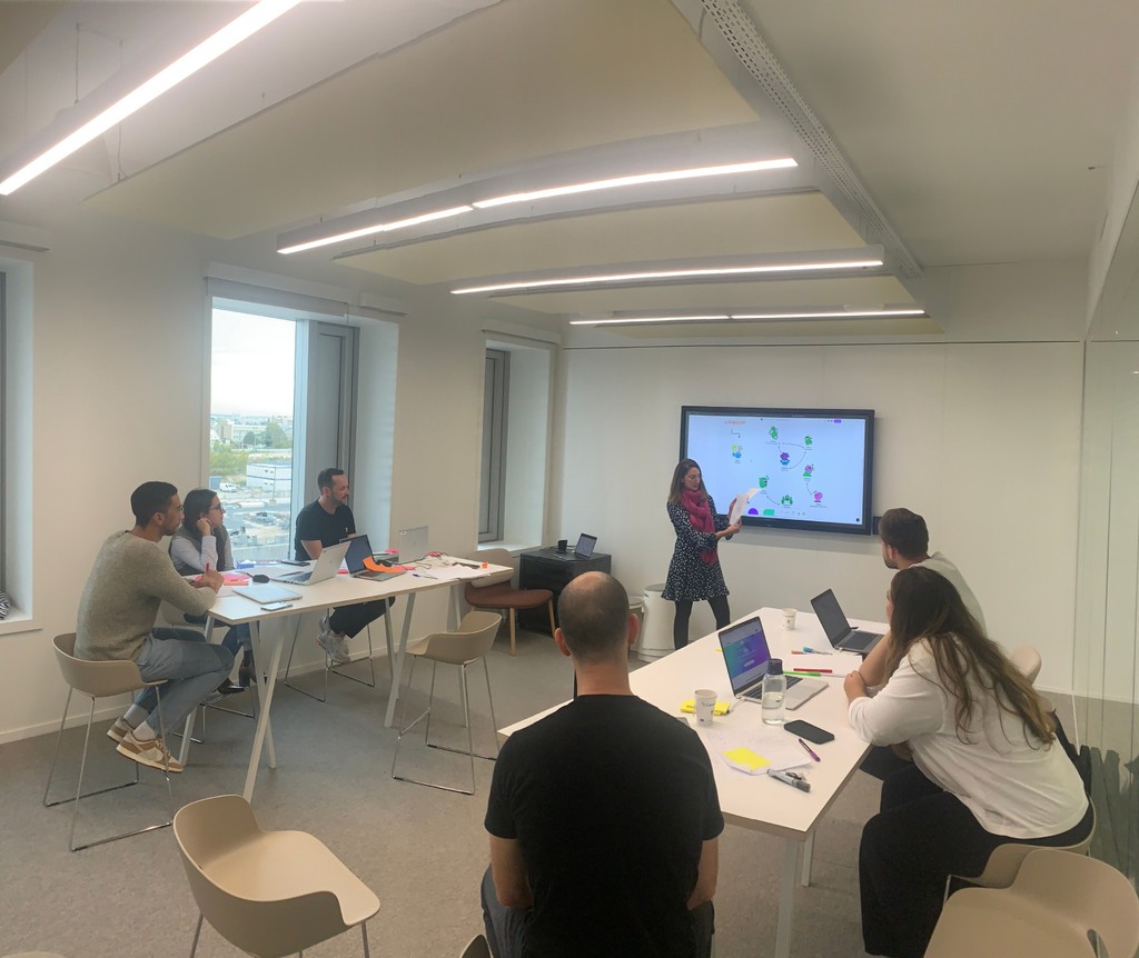


Moments during the design workshop
THE SOLUTION
Redesigning for clarity and engagement
To address the challenges identified, we set out to created a more engaging and user-friendly landing page. The goal was to enhance the overall user experience while clearly communicating the value of Ulys' subscription offers.
We crafted a layout that presented the promotional offer clearly and concisely. The design emphasizes various benefits, making it easy for users to grasp the value proposition at a glace.
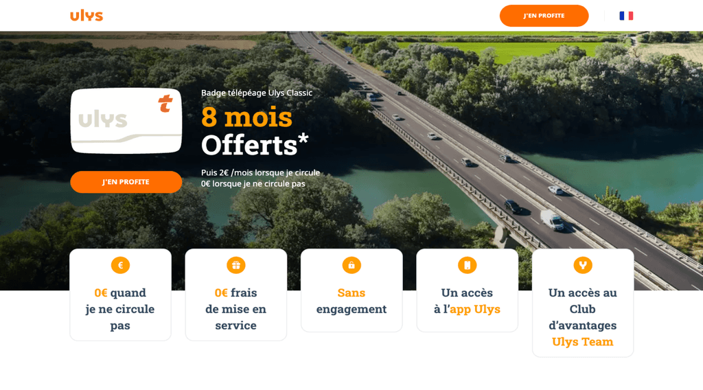


Before
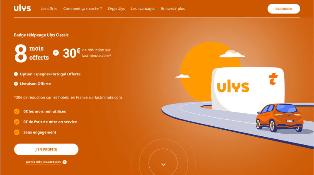


After
Additional sections
Additional sections
New sections were introduced to provide users with essential information and highlighting the benefits of subscribing to Ulys. This content aimed to inform and persuade potential clients, ensuring they understood what they would gain from the service.
New sections were introduced to provide users with essential information and highlighting the benefits of subscribing to Ulys. This content aimed to inform and persuade potential clients, ensuring they understood what they would gain from the service.
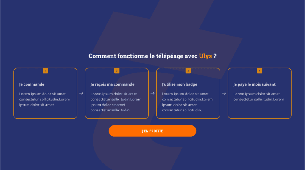
"How it works" section
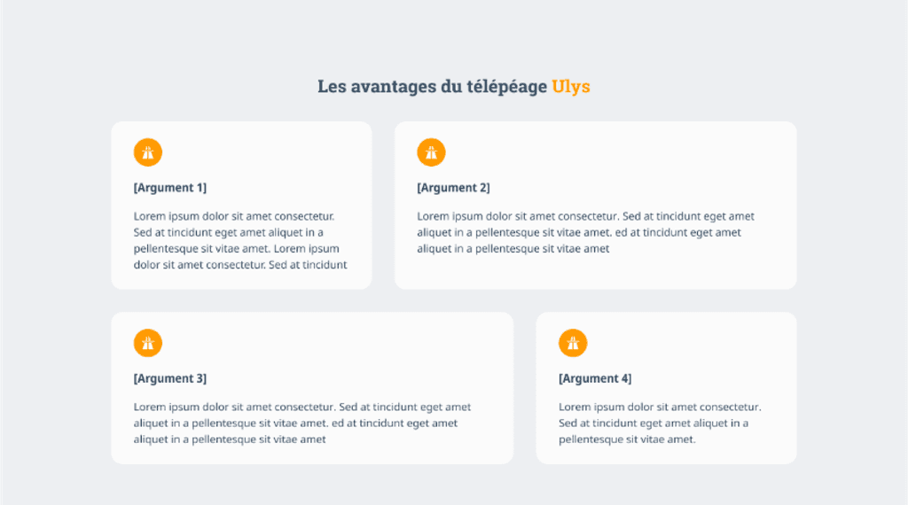
Advantages of subscribing to Ulys
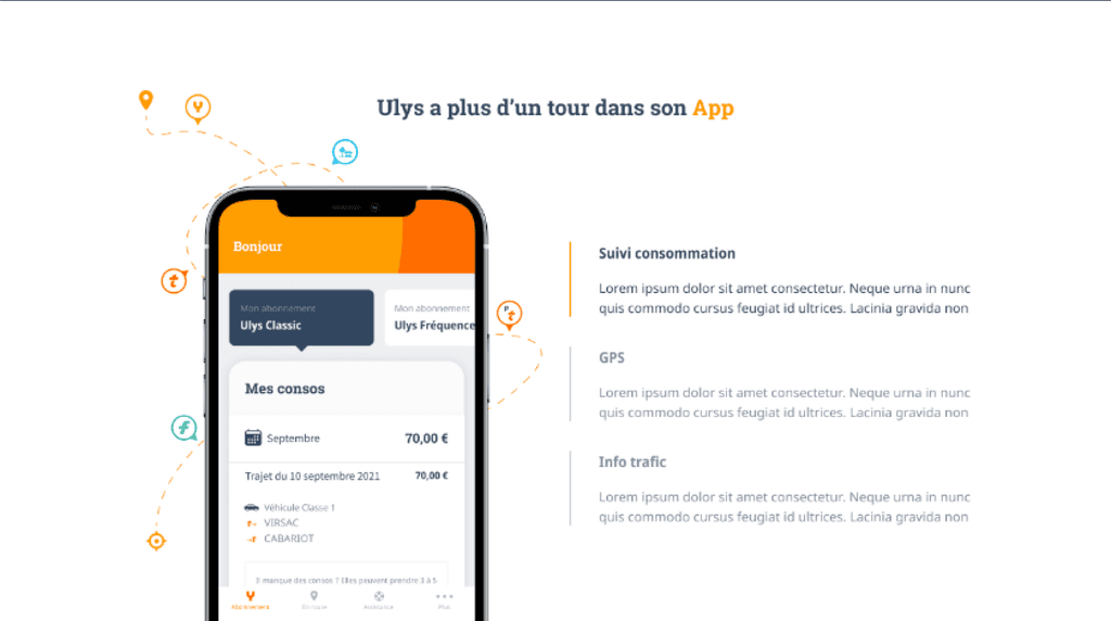
App explanation section
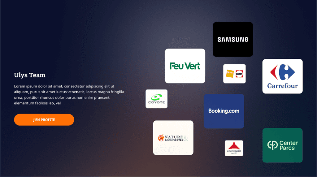
Good deals, discount section
Video explanation section

"How it works" section

Advantages of subscribing to Ulys

App explanation section

Good deals, discount section

Video explanation section
Conclusion
Conclusion
Results
After finalizing the wireframes and handing them off to our developers, the acquisition team conducted A/B tests to mesure the impact over a one-month period. The team reported an increase of 1,7% in users entering the subscription tunnel indicating that the new landing page improved the conversion rates and validating our design efforts.
Reflection
While working on this project, I learned the importance of collaboration and effective communication. I realized that different opinions can lead to misunderstanding which can result in time waste and a lot of revisions. This experience taught me that proactive communication is key to maintaining a project momentum and archive successful outcomes.
While working on this project, I learned the importance of collaboration and effective communication. I realized that different opinions can lead to misunderstanding which can result in time waste and a lot of revisions. This experience taught me that proactive communication is key to maintaining a project momentum and archive successful outcomes.
