Ulys
Ulys
Ulys


[OVERVIEW]
Ulys emerged in 2019 as Vinci Autoroutes’ answer to seamless highway experiences. With over 6 million users (2023) trusting its toll badge system, Ulys becomes a staple for both individual travelers and professionals alike.
As a product designer apprentice, I was entrusted with a crucial mission: to breathe new life into Ulys' help center, a vital resource that has begun to show signs of wear.
[ROLE]
Product designer
[SCOPE]
Research
UI Design
[YEAR]
Apr - Sept 2023
Introduction
Introduction
Ulys' support hub, serves as the first point of contact for assistance. A well designed help center allows users to find information quickly. But, the current support hub isn't optimized for that.
Ulys' support hub, serves as the first point of contact for assistance. A well designed help center allows users to find information quickly. But, the current support hub isn't optimized for that.


Trustpilot user review
Trustpilot user review
The problem
The problem
The existing help center is outdated and confusing and users struggles to locate information they need which leads to a frustrating experience and an increase in calls to customer service. The inefficiency strains resources and negatively impacts the user experience.
Thus, we asked:
The existing help center is outdated and confusing and users struggles to locate information they need which leads to a frustrating experience and an increase in calls to customer service. The inefficiency strains resources and negatively impacts the user experience.
Thus, we asked:
How might we create a more intuitive and user-friendly help center experience, especially on mobile devices?
How might we create a more intuitive and user-friendly help center experience, especially on mobile devices?
The process
The process
Collaboration was key. Bi-weeky meetings with the product manager and Friday check-ins with stakeholders became my compass, guiding the project with valuable insights and feedback.
Collaboration was key. Bi-weeky meetings with the product manager and Friday check-ins with stakeholders became my compass, guiding the project with valuable insights and feedback.
THE SOLUTION
Streamiling user support with an optimized Help Center
Redesigning the help center and its related pages to create an efficient and responsive experience that empowers users to find answers quickly.
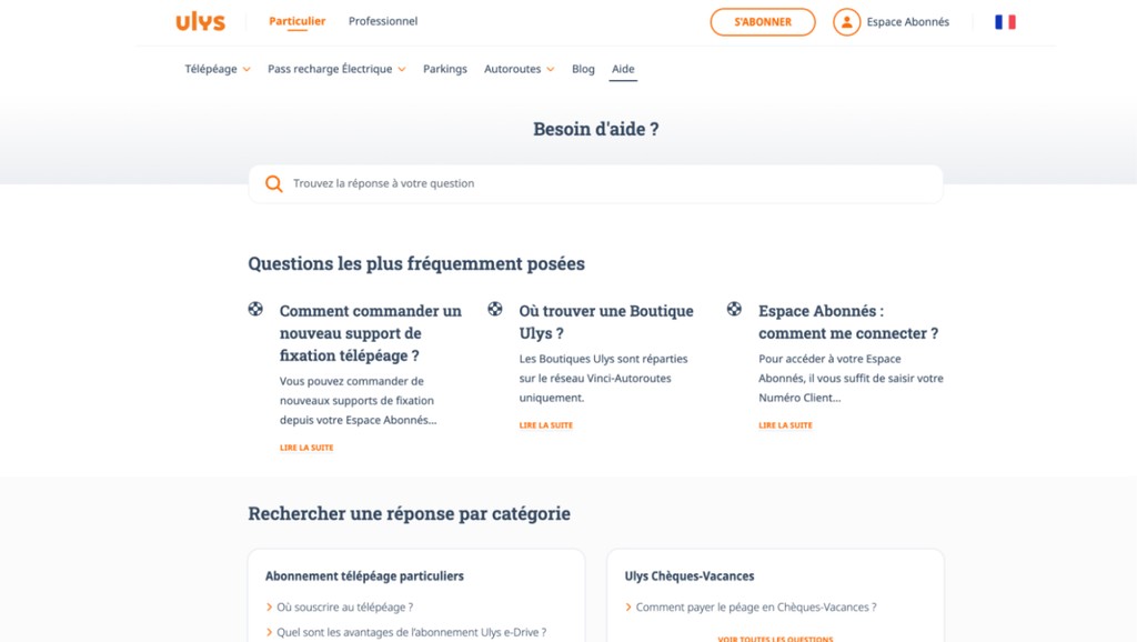


Before
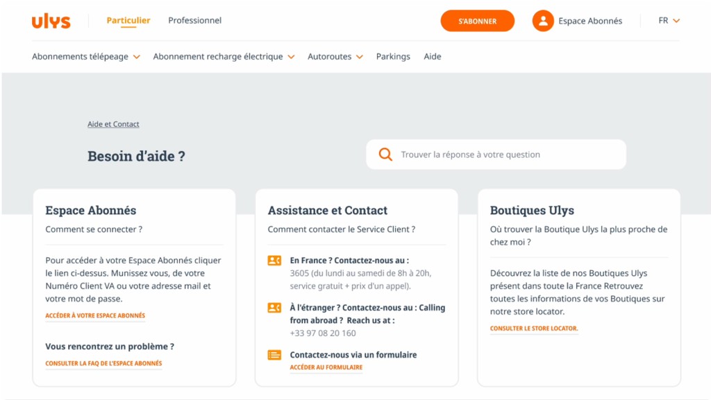


After
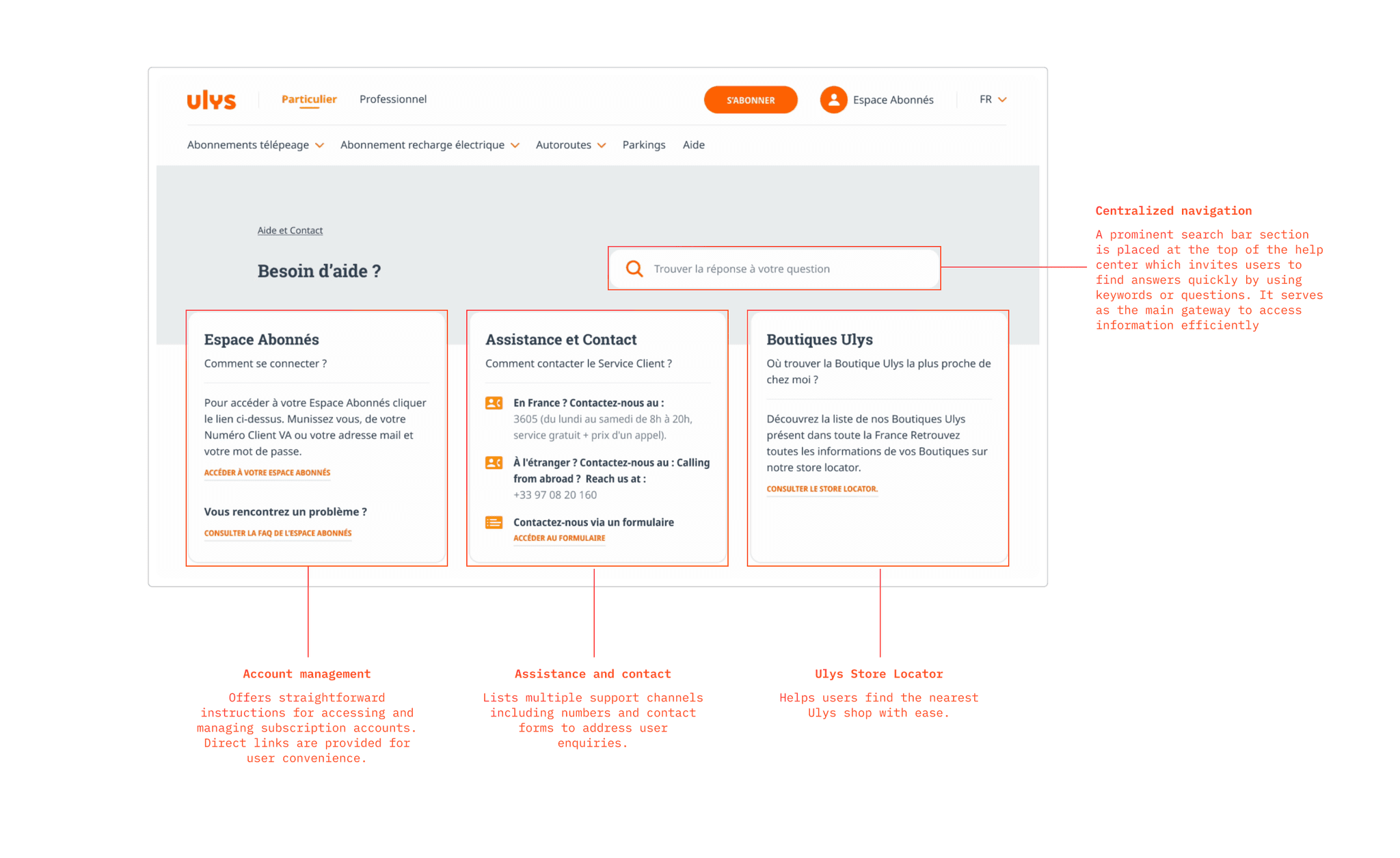
The homepage
The homepage
It was crucial to present the information in a clear and organized manner. By prioritizing user needs, we ensure that essential content was immediately accessible.
It was crucial to present the information in a clear and organized manner. By prioritizing user needs, we ensure that essential content was immediately accessible.


Mobile optimization
Mobile optimization
With 80% of users accessing the help center on a mobile device a responsive design was essential. The layout adapts to different screen sizes, ensuring a consistent user experience.
Desktop
Mobile
Category pages
Category pages
Following the user journey, when users select a category from the home page below the three sections, they are directed to dedicated pages that gather a complete list of questions.
In some instances, questions are further grouped into subcategories to enhance findability.
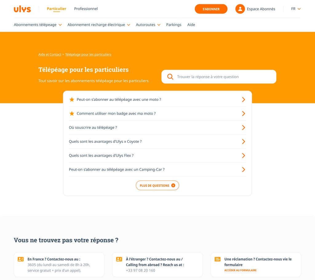


One subcategory
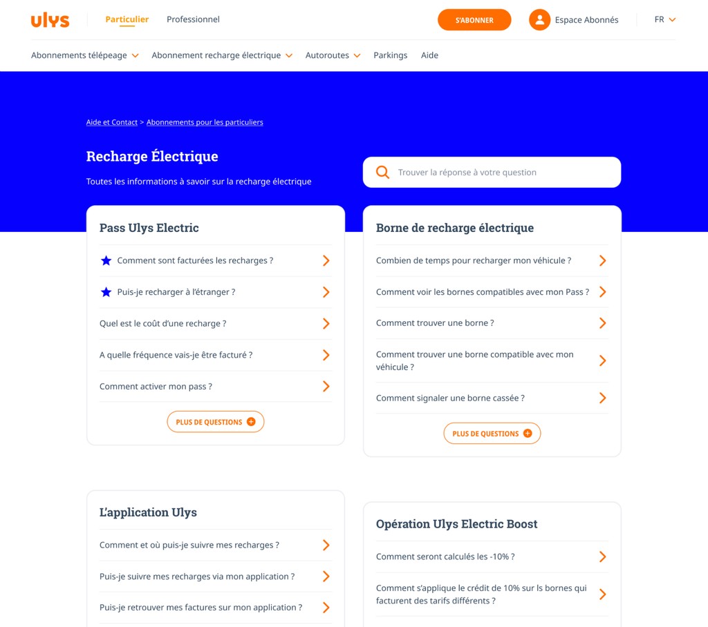


Multiple subcategories
Answer hub
Answer hub
The answer hub prioritizes information with a clear and concise format. Answers are wrapped into a box for easy identification, accompanied by the review widget. A section on the left provides various ways to contact customer service if further assistance is needed. As mentioned earlier, every element was crafted with a mobile-first approach ensuring seamless adaptation across devices.
The answer hub prioritizes information with a clear and concise format. Answers are wrapped into a box for easy identification, accompanied by the review widget. A section on the left provides various ways to contact customer service if further assistance is needed. As mentioned earlier, every element was crafted with a mobile-first approach ensuring seamless adaptation across devices.
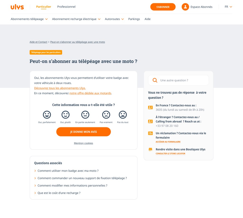


Desktop
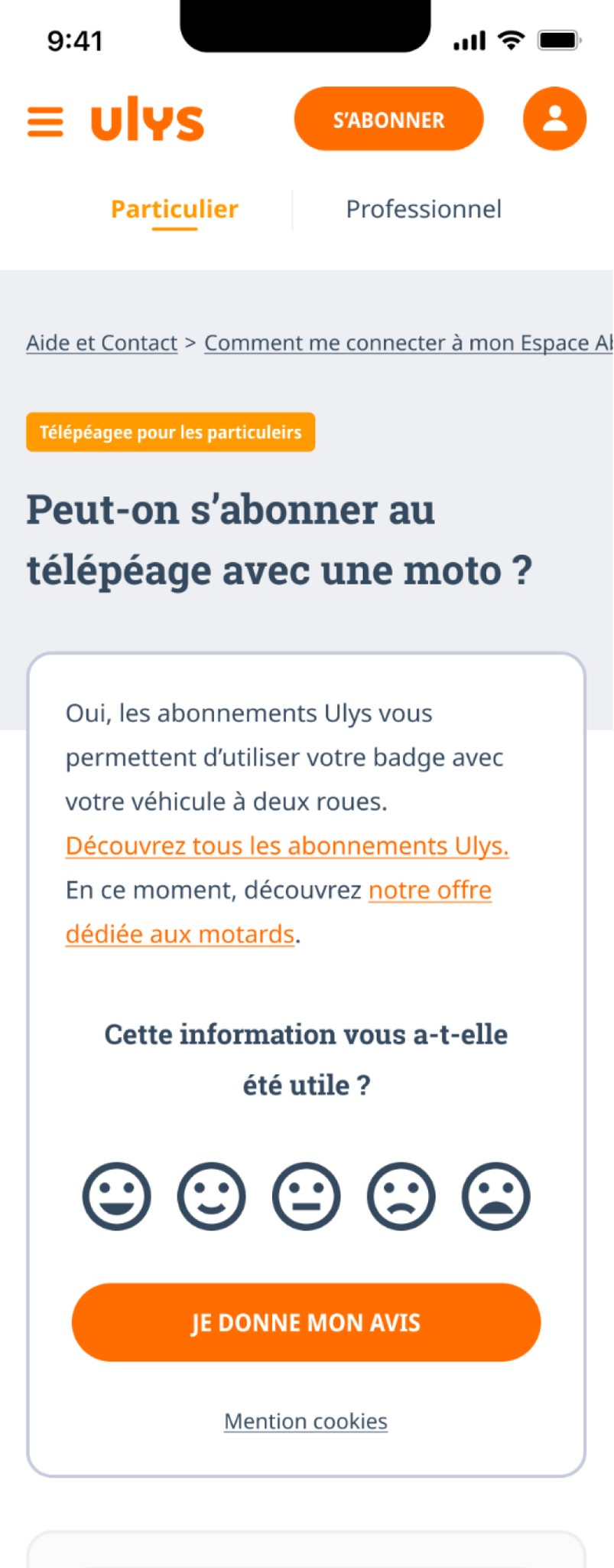


Mobile
Conclusion
Conclusion
A plot twist
Despite the hard work and approval for Q3's roadmap presentation, the redesign faced unexpected hurdle. Other pressing demands took priority, and the project was put on hold.
Despite the hard work and approval for Q3's roadmap presentation, the redesign faced unexpected hurdle. Other pressing demands took priority, and the project was put on hold.
The legacy
As my apprenticeship drew to a close, I ensured that the project could smoothly be passed on to my next successor, laying the groundwork for future improvements.
As my apprenticeship drew to a close, I ensured that the project could smoothly be passed on to my next successor, laying the groundwork for future improvements.
Reflection
This project greatly enhanced my design skills. I was given freedom to explore ideas and solutions, deepening my design process and proficiency with Figma. This journey was a crucible for growth. While it didn't reach its final destination during my tenure, it paved the way for future enhancements and left a remarkable mark on my professional development.
This project greatly enhanced my design skills. I was given freedom to explore ideas and solutions, deepening my design process and proficiency with Figma. This journey was a crucible for growth. While it didn't reach its final destination during my tenure, it paved the way for future enhancements and left a remarkable mark on my professional development.