Sud Ladies' Cup
Sud Ladies'
Cup
Sud Ladies' Cup


[OVERVIEW]
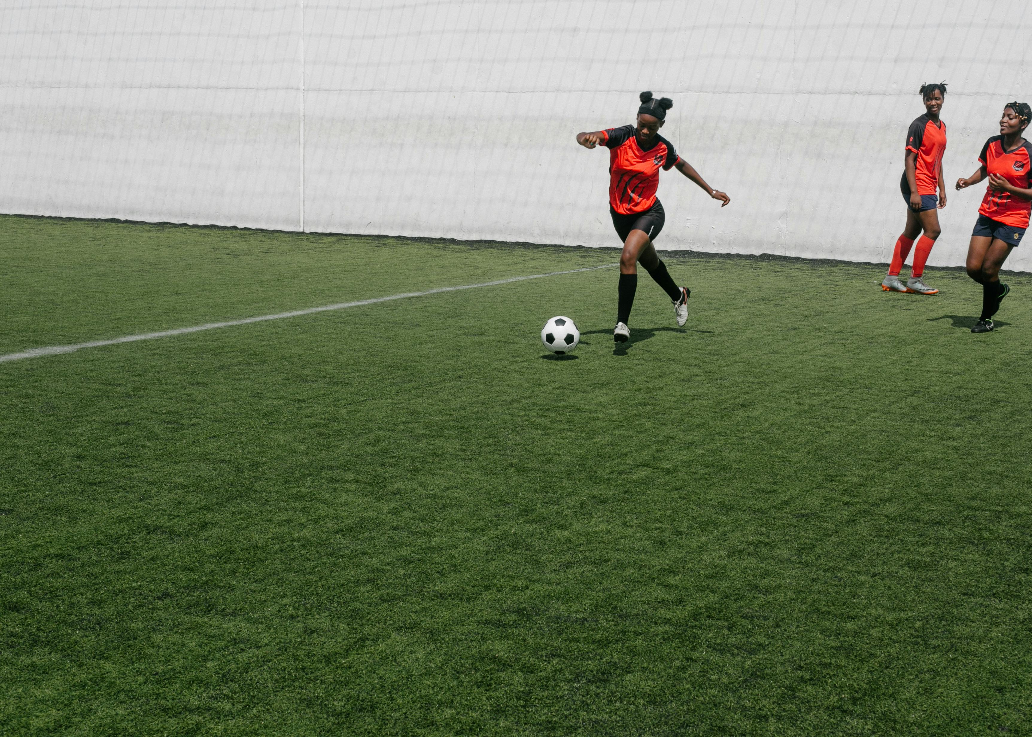
Sud Ladies' Cup is a women's football tournament launched in 2018 held in the south of France. Every year it gathers under-20 national teams from all over the world.
As a graphic designer at Nehms Studio, I led the creation of their new visual identity.
[ROLE]
Graphic Designer
[SCOPE]
Brand identity
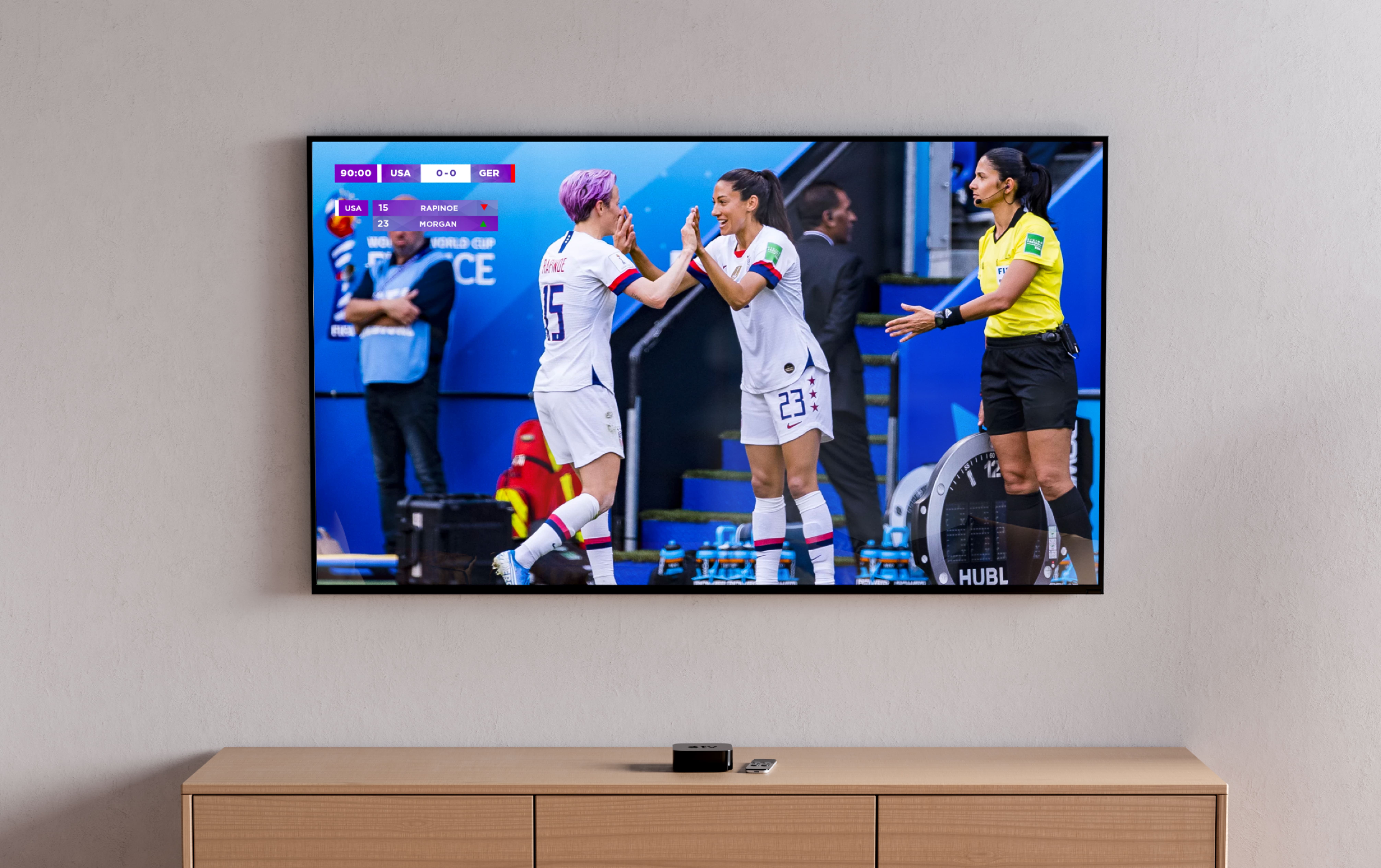
TV graphics
[TIMELINE]
June 2022
The brief
The brief
During my apprenticeship as a graphic designer at Nehms Studio, the representative of the Sud Ladies' Cup approached us to create a new brand identity and TV graphics for the upcoming 3rd edition broadcasted on the L'équipe TV channel.
During my apprenticeship as a graphic designer at Nehms Studio, the representative of the Sud Ladies' Cup approached us to create a new brand identity and TV graphics for the upcoming 3rd edition broadcasted on the L'équipe TV channel.
THE SOLUTION
A new look
A new look
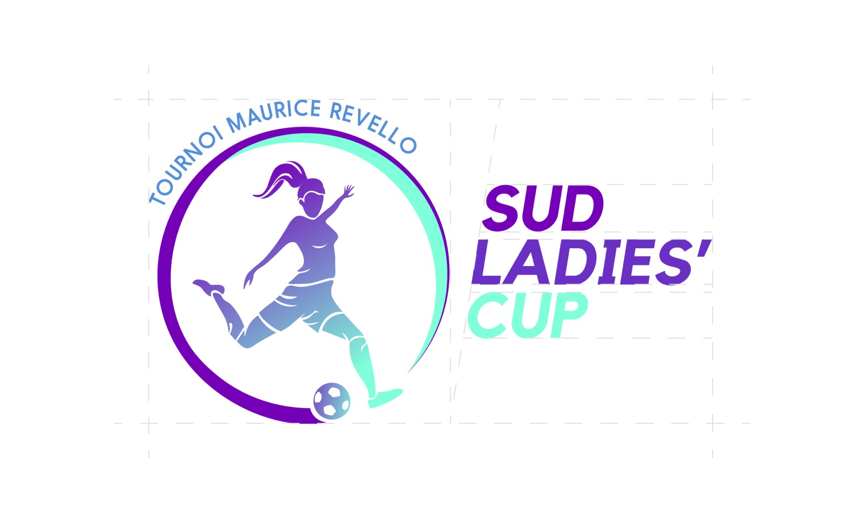
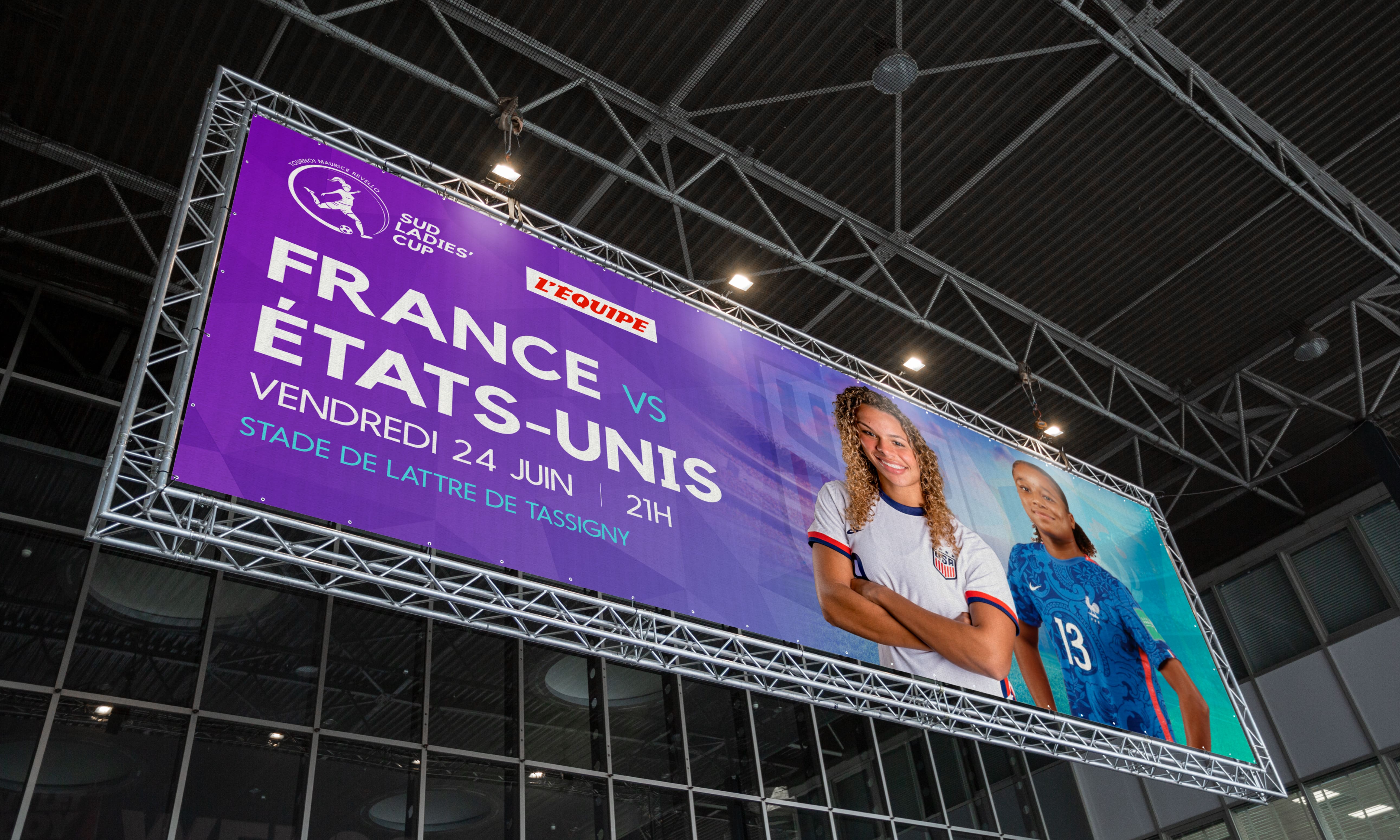
The logo illustrates a girl kicking a ball highlighted by a semicircle that evokes the dynamic movement of the ball around her. The primary color palette, features four vibrant and modern colors, while the secondary palette is a gradient derived from the primary palette's hues.
In terms of typography, we opted for Kollektif and Nanami, neat and easy to read typefaces ideal for TV screens.
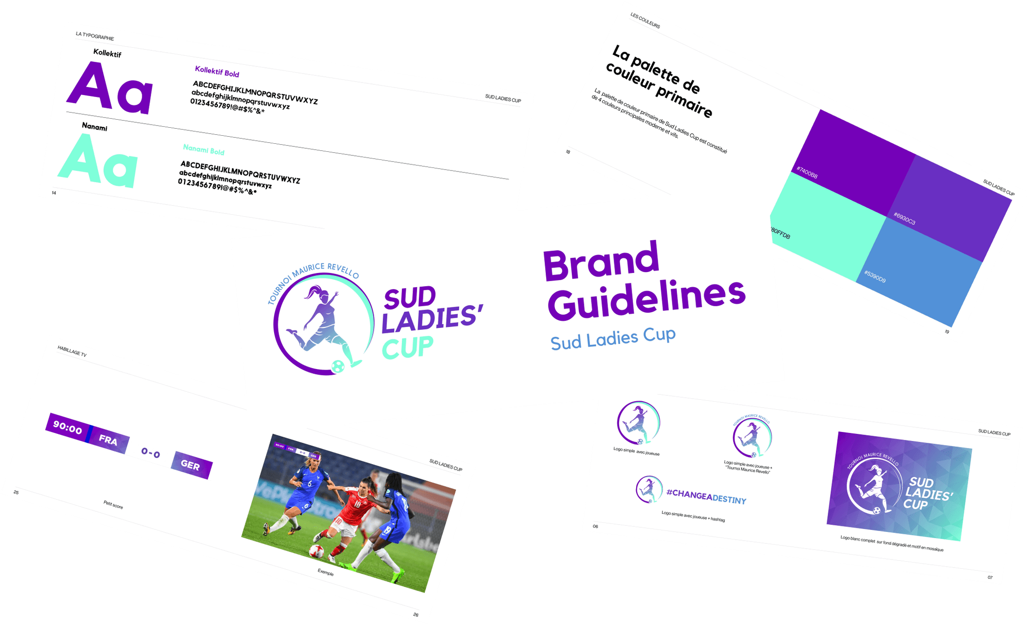


#6930C3
#6930C3
#7400B8
#7400B8
#80FFDB
#80FFDB
#5390D9
#5390D9






Conclusion
Conclusion
Results
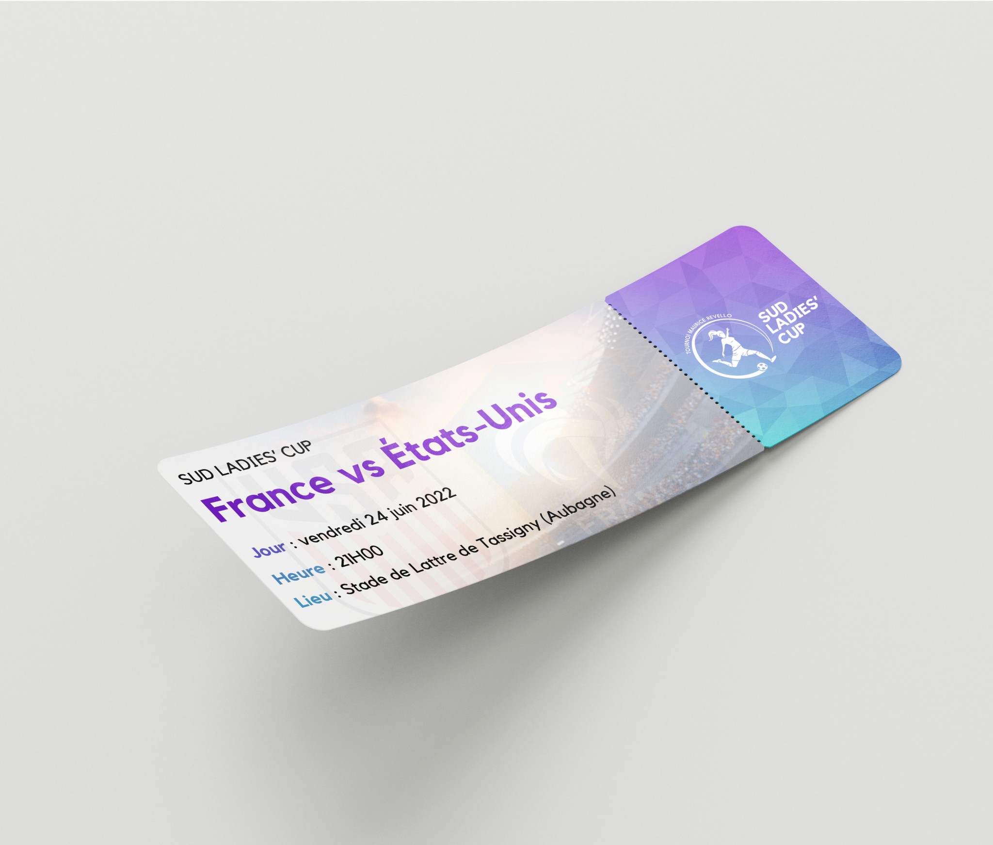
The new visual identity received a positive feedback from the audience and was even broadcasted in Mexico. As of 2024, it continues to be used as the current identity across all platforms.
The new visual identity received a positive feedback from the audience and was even broadcasted in Mexico. As of 2024, it continues to be used as the current identity across all platforms.
Reflection
I was honored to be able to take part of the amazing project. Working on TV graphics for the first time was a challenge but thanks to my team I was able to deliver the best outcome.
I was honored to be able to take part of the amazing project. Working on TV graphics for the first time was a challenge but thanks to my team I was able to deliver the best outcome.